Mapping my Lockdown Bike Rides
I enjoy cycling. This surprises no one, as my middle class white nature compels me to. But nonetheless, I accept the stereotype and find myself doing more and more of it during lockdown as it breaks up the long days of coding.
As a GIS nerd, I figured I should map the rides in some kind of meaningful way. I need to do this anyway at some point for my pollution exposure study. This gives me enough justification to ignore my other courses and spend a ludicrous amount of time making it visually appealing.
First, I needed my ride data in some usable form, then I could turn to Python to do all of the analysis and presentation. My rides were recorded as .gpx (a format I dislike enough to write an alternative) from my Xiaomi Mi Watch Lite. This is the cheapest smartwatch I could find that had GPS tracking. Unfortunately, you cannot install any apps on it nor can you extract the telemetry with ease. Luckily, if you are willing to learn Portugese (or use Google Translate of course) there is a mod to the default Xiaomi Wear app by a group of Brazilians that lets you extract the ride in .gpx, which I succeeded in doing after several hours of messing around with my old friend ADB. I supplemented this GPS trajectory with a video of my ride in first-person built from an Autographer lent to me by my supervisor. This obscure little device takes pictures every ~20 seconds, which I combined into a video using ffmpeg.
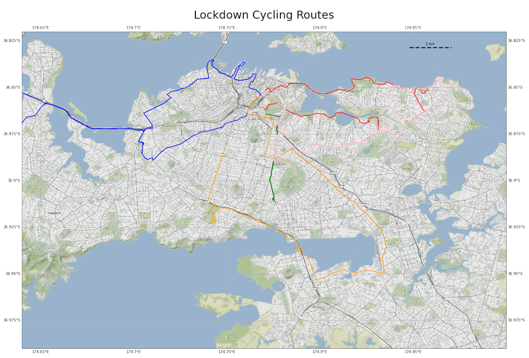
Now that the data was all clean and ready to go, I could move on to mapping! I started with matplotlib and cartopy, as I didn’t have much experience with static cartography in Python. The documentation leaves a bit to be desired, but the tools are very powerful, and I was able to plot the .gpx files with a basemap:
But who wants a static map in 2021? Working with folium (a Python library that produces html leaflet maps), I got to work making a webmap that included the Autographer videos. I ran in to a couple of interesting problems I thought were worth sharing:
Tooltips vs Popups - I wanted the user to be able to move their mouse over a track and view stats about it. You can do this using the tooltip function, which builds a GeoJSON from whatever layer you are viewing and prints the properties. The problem with this is that any html you put in the tooltip gets formatted weirdly, so you can't be as precise as you can with a popup. Popups display html but cannot be called on mouse hover. So what I did was use an html renderer to produce html outputs that are displayed on the tooltip as an image. It's janky, but it works.
Gif to Video - Theoretically I should have been able to play the Autographer video using the html video tag. This did not work for whatever reason, so I had to create a gif using ffmpeg. Eventually I automated this, so a subprocess is called in the Python code which runs ffmpeg on a folder of photos to create a video, then another subprocess swoops in and converts the video to a gif.
Folium Plugins - Folium is really cool, but does not include a lot of the features Leaflet itself offers. I wanted to produce an 'AntPath', or a line that has a series of dots that move to show direction of the trajectory. I previously did this using ipyleaflet, but really did not want to use Jupyter in this project. Luckily, if you view the definition of the folium class you can see that you can access plugins from the html of leaflet. Just import folium.plugins and, after creating a map object, call the options.update function to gain access to many of the leaflet settings that are not plainly available in folium.
All of this culminated into a webmap I host on GitHub pages. You can view the full site here, and I have embedded a copy of the map below. If you hover over a track (give it a second, the gifs are large) you can see some stats of the trajectory as well as the Autographer images and a placeholder matplotlib plot for pollution data.
I hope you enjoyed reading. As always, comments and criticisms are welcome - flick me an email :)